How to Create Stunning Product Review Comparisons with Visme infographics
Introduction
Customers now rely heavily on product reviews when deciding what to buy in today’s fiercely competitive online market. But it might be difficult to produce material that stands out and draws in potential customers when so many reviews are available.
Conventional reviews with a lot of text can be overwhelming and tiresome to read, which makes many people ignore important details. Visual storytelling, particularly infographics, is important in improving readability and engagement.
With the help of the robust and intuitive design tool Visme, designers may turn mundane product review comparisons into eye-catching infographics. Your audience will find it easier to understand the main distinctions and advantages of the products under comparison if you use Visme to present complex information in an appealing, well-organized, and straightforward manner.
This post explains why Visme is the best platform for creating comparisons of product reviews that are unique and how to use its capabilities to improve the caliber of your content and increase viewer engagement.
Why visual content matters in product reviews
reviews before delving into Visme’s intricacies. According to studies, images are processed by the human brain 60,000 times more quickly than text. Furthermore, compared to articles with just text, those incorporating pertinent images and graphics had substantially higher engagement rates and social media shares.
In product reviews, visualizations like charts, graphs, and icons make the evaluation process easier, especially when comparing products. Potential buyers can rapidly scan a well-designed infographic to grasp the information they require rather than reading long paragraphs outlining features, costs, advantages, and disadvantages.
The user experience is enhanced and conversion rates are raised by this instant access to information.
What is Visme and why use it for product review comparisons
Visme : is a comprehensive visual content creation tool made to enable anyone to create expert graphics without the need for complex design knowledge.
Visme has a comprehensive library of customisable templates, a variety of charts, icons, and data visualization tools, and an easy-to-use drag-and-drop interface, unlike complicated design software that could be too intimidating for novices.
Key features of Visme product review comparisons
- Customizable Templates: Visme makes it simple to get started on your project by offering a variety of templates created especially for comparisons. You can arrange content rationally and aesthetically with the aid of these templates.
- Variety of Chart Options: Visme provides flexible charting tools to efficiently visually depict product data, whether you like bar charts, pie charts, or rating scales.
- Icons and visuals: By using the thousands of icons and visuals at your disposal, you may attract attention to and make sense of important features, advantages, or disadvantages.
- Interactive components: You can use animations, clickable components, and pop-ups in interactive infographics made using Visme, which can further boost user engagement.
- Export Options: Infographics can be downloaded in a variety of formats, including PNG, PDF, or integrated straight into your social media accounts or website.
How Product Review Comparisons Are Made Easier with Visme
The ability of Visme to streamline intricate design chores is one of its biggest benefits. Visme levels the playing field for marketers, bloggers, and small company owners who might not have access to qualified graphic designers by providing:
- Usability: You don’t have to worry about challenging software learning curves thanks to the drag-and-drop mechanism. Just pick a template, add your information and pictures, and alter the styles to fit your company’s needs.
- Time Efficiency: You can quickly produce sophisticated infographics using pre-made templates and materials, freeing you up to concentrate on marketing strategy and content quality.
- Consistency: To have a consistent appearance across several reviews, Visme lets you make branded templates.
Visme’s Useful Applications in Comparing Product Reviews
Examine the following real-world examples to see how Visme may improve your product reviews:
- Feature-by-Feature Comparison: To help users quickly identify differences, display important product characteristics side by side using checkmarks, icons, or ratings.
- Pricing Overview: To visually depict the cost comparison and emphasize more affordable solutions, use price tags or bar charts.
- Pros and Cons: To make the summary easier to read, use icons or color-coded lists to highlight the benefits and drawbacks.
- User Ratings: To gain your audience’s trust, display user reviews or ratings using score bars or star charts.

Step by step guide to create stunning product review comparisons with visme infographics
Getting your audience’s attention is essential in the fast-paced digital world of today, particularly when it comes to product reviews and comparisons.
An effective infographic may increase engagement, streamline complex information, and speed up the process of potential customers making well-informed decisions. A user-friendly method for producing visually striking and memorable product review comparisons is provided by Visme, a robust visual content production tool.
From selecting the ideal template to creating an engaging call-to-action, this thorough guide will take you through every stage of the procedure, guaranteeing that your infographic is both aesthetically pleasing and functional.
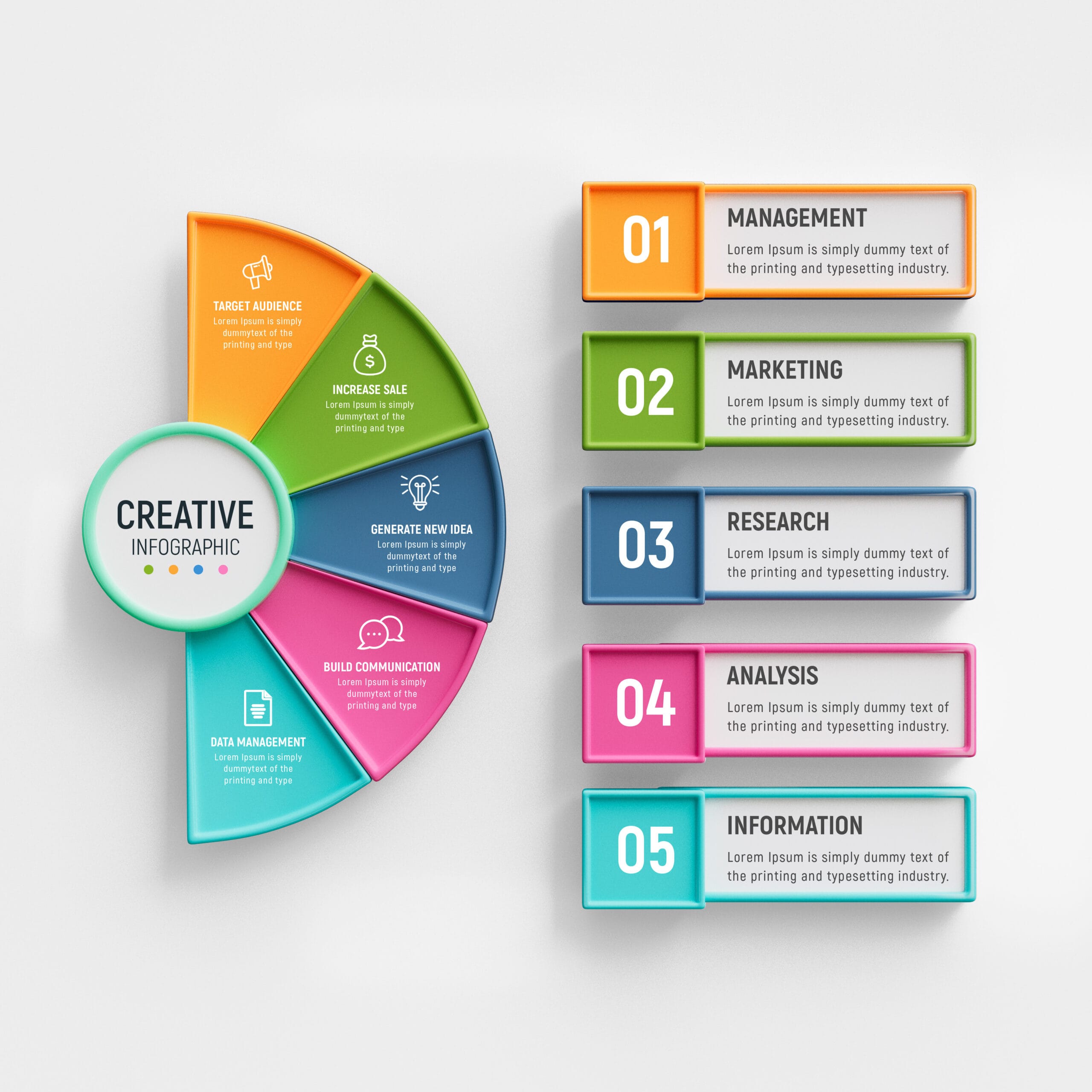
- Select a Template: Begin with the Ideal Base
Making an effective product comparison infographic starts with choosing a template that fits your message, style, and niche. Visme provides an extensive collection of well-created templates with different layouts, color schemes, and information blocks that are specifically suited for product comparisons.
The Significance of Template Selection
Selecting the appropriate template guarantees your infographic is easy to read, helps you keep visual consistency, and directs the flow of your content.
For instance, a sleek, contemporary style with bold words and clean lines would be ideal for comparing tech devices. Conversely, a more vibrant and lively design might work well for toy or lifestyle product comparisons.
Advice on Selecting the Ideal Template
1. Match Your Brand Style: To select a template that enhances your identity, take into account the color scheme, typography, and general aesthetic of your brand.
2. Content Density: Choose the quantity of information you wish to provide. While some templates work well for short summaries, others support rich data.
3. User Experience: Choose a layout that makes it simple to scan; make good use of headings, sections, and white space.
4. Mobile Friendly: Since many consumers access material via phones or tablets, make sure the template appears excellent on these platforms.
After choosing your template on Visme, alter the basic components, including the backdrop, typefaces, and colors, to better represent your company and the tone of your review.
2.Identify What Is Most Important and Enumerate Essential Features
Determine the essential features and standards that will serve as the foundation for your product comparison before you begin creating your infographic. These attributes must be pertinent to your target market and emphasize the unique selling points of each product.
How to Spot Important Elements
- Determine the Priorities of Your Audience: What matters to your readers? Cost? Sturdiness? Simple to use? Usability?
- Product Specifications: To obtain precise information, consult the official product details and user reviews.
- Competitive Advantages: Emphasize the special features or disadvantages that set each product apart.
- Keep the Features to a Minimum: Viewers may become overwhelmed by too many points of comparison. For clarity, concentrate on the 5-8 essential features.
Common features to include :
- Cost and accessibility
- Performance indicators (efficiency, speed)
- Quality of design and construction
- Power usage or battery life
- Guarantee and assistance
- Reviews and ratings from users
- Extra characteristics or add-ons
To keep your infographic flowing smoothly, put comparable aspects together and arrange your list properly.
- Include Visuals to Make Information Easier to Understand
The ability to add a variety of visual components that turn text-heavy content into captivating images is one of Visme’s greatest benefits. Icons, charts, and color coding are examples of visual cues that make it easier for users to scan and comprehend information rapidly.
Making Good Use of Icons
Concepts are visually represented by icons, which also lessen cognitive stress. Use a lightning bolt to represent battery life, a shield to represent warranty, or a dollar sign to represent price. You can use the thousands of customizable icons that Visme offers to keep your design and size consistent.
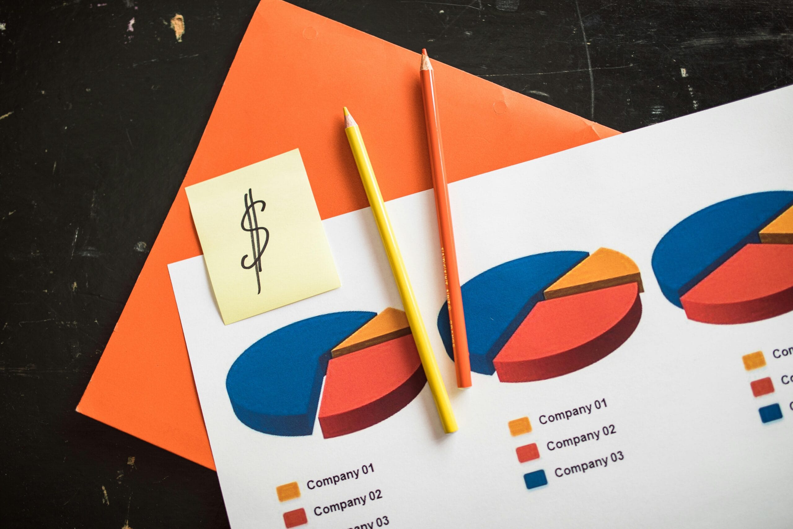
Including Graphs and Charts
When comparing quantifiable data, like pricing, battery life, or ratings, charts are perfect. Employ pie charts, bar charts, or Rating systems to properly display these comparisons. Advantages of the product are immediately communicated by visual variations in chart lengths or colors.
Using Color Coding
Make strategic use of color to highlight important details or differentiate products.
For example:
- Throughout the infographic, give each product a distinct color.
- To symbolize positive attributes, choose blue or green.
- To attract attention to flaws or shortcomings, use red or orange.
Keep your color scheme accessible by steering clear of combinations that are hard for colorblind people to tell apart.
Visual Design Advice
- To prevent clutter, keep graphics clear and simple.
- Text and images should be balanced so that they enhance rather than overshadow one another.
- To improve readability and divide sections, use a lot of white space.
- Draw Attention to Differences: Stress What Makes Products Unique
Your infographic should demonstrate the strengths and weaknesses of each product rather than merely listing features side by side. By emphasizing these variations, readers can more easily determine which product best meets their needs.
Methods for Emphasizing Disparities
- Contrasting Colors: To highlight strong points or significant flaws, use striking or contrasting colors.
- Bold Fonts: Use bold or larger fonts to draw attention to important numbers or phrases.
- Symbols and Labels: To highlight advantages, disadvantages, or noteworthy differences, use checkmarks, crosses, stars, or arrows.
- Callouts: To highlight the significance of a feature or the performance of a product, use text boxes or callouts.
For instance
- Put a green checkmark and the words “Longest battery life” on the product that has the longest battery life.
- Use the notation “Most expensive option” to draw attention to a greater price in red.
- To highlight consumer happiness, use star ratings or excerpts from user reviews.
Without being overpowering, the intention is to direct the viewer’s attention to the most significant parallels.
- Incorporate an Unambiguous Call to Action: Direct the Next Actions of Your Audience
Without a compelling call-to-action (CTA) that instructs viewers on what to do after viewing your comparison, an infographic is incomplete. The call to action (CTA) transforms interaction into meaningful action, whether it’s buying something, reading a review in its entirety, or subscribing to a newsletter.
Creating Powerful CTAs
- Be Clear and Direct: Make use of action verbs such as “Get Your Discount,” “Learn More,” “Compare Prices,” and “Buy Now.”
- Strategic Placement: After the visitor has read the material, place the call to action at the bottom or end of the infographic, where their attention will naturally fall.
- Make It Visually Distinct: To highlight the CTA, use buttons, contrasting colors, or arrows.
- Include Incentives: To motivate quick action, if appropriate, mention time-limited deals, free trials, or special discounts.
Including Calls to Action in Your Content
Connect your call to action to reliable resources like affiliate links, official product pages, or in-depth blog posts. Your audience’s trust can be increased by being open and honest about affiliate relationships.
Advantages of Product Reviews Using Visme Infographics
Content producers and marketers are always looking for new and creative ways to draw in viewers and effectively communicate information in the digital age. Plain language frequently falls short of engaging users or effectively conveying complicated data when it comes to product reviews and comparisons.
Visme infographics provide a revolutionary edge in this situation. Visme assists brands and bloggers in establishing a more meaningful connection with their audience by converting dry data into aesthetically pleasing and interactive visuals.
This post examines the main advantages of utilizing Visme infographics, emphasizing how they increase shareability, simplify comprehension, and increase engagement—all of which contribute to the overall strength and effect of your product reviews
1. Improved Engagement: Holding Readers’ Attention for Longer
The capacity of Visme infographics to boost user engagement is among its most important benefits. According to studies, internet users’ attention spans are getting shorter, and they frequently scan articles instead of reading them. The eye is naturally drawn to visuals, which entice consumers to delve deeper into information exploration.
The Significance of Visual Engagement
- Longer Time on Page: Users are more likely to remain on an infographic that is well-designed. This extra time improves your SEO rankings by telling search engines like Google that your material is valuable.
- Lower Bounce Rate: By encouraging users to engage with the material rather than departing right away, captivating infographics can lower bounce rates.
- Interactive Features: To improve user engagement and retention, Visme incorporates interactive elements such as pop-ups, clickable hotspots, and animations.
Impact on the Real World
This implies that prospective customers are more likely to pay attention to your main selling points, thoroughly weigh their options, and believe what you have to say when it comes to product reviews. Infographics help readers make decisions in a visual and intuitive way by creating a storytelling environment that text alone cannot match.
2. Simplifying Complicated Information for Easier Understanding
Product reviews frequently include user ratings, pricing models, performance measurements, and comprehensive specifications—information that can be too much for readers to process if it is just provided in text format. By dividing information into easily readable, visually distinct pieces, Visme infographics simplify this complexity.
How Infographics Facilitate Understanding
- Visual Hierarchy: Infographics use layout, color, and size to emphasize the most crucial information first, making it easier for readers to rapidly understand the main ideas.
- Icons and Symbols: These visual aids expedite comprehension by replacing drawn-out explanations with instantly identifiable symbols.
- Graphs and Charts: Bar charts, pie charts, and rating systems make quantitative comparisons easier to understand and make it simple to identify which product performs better in various categories.
- Color Coding: By designating colors to strengths and weaknesses, a product’s performance may be instantly understood.
Advantages for Your Viewers
Your infographics enable users to make more informed purchasing decisions without feeling overloaded by demythologizing information. Your authority in the niche is established by this clarity, which also builds user trust in your material and motivates them to return for more reviews.
3. Shareability: Increasing Your Audience Naturally
Easy-to-share material has a clear advantage in the connected world of today. Using Visme to produce visually appealing infographics increases the likelihood that they will be shared on blogs, forums, and social media sites, spreading your message without incurring extra advertising expenses.
The Reasons Infographics Spread
- Visual Appeal: Since photos are easier to see and process, people naturally prefer sharing them over text.
- Simple Embedding: Visme provides straightforward solutions for embedding infographics on websites, which makes it easy for other content producers to reference or reuse your work.
- Branding Opportunities: When shared, infographics that are personalized with your logo and colors help raise brand awareness.
- Cross-Platform Friendly: Infographics maximize your potential audience by adjusting nicely to various platforms, including Facebook, LinkedIn, Instagram, and Pinterest.
Advantages from a Strategic Perspective
Increased shareability expands the organic reach of your content and boosts website or social media traffic. Increased subscribers, followers, and eventually, improved conversion rates for affiliate sales or product purchases might result from this increased visibility.
Extra Advantages of Visme Infographics
Although the main benefits are increased engagement, comprehension, and shareability, Visme infographics also have a number of other significant advantages that are worth mentioning:
- Professional Quality Without Design Skills: Even novices may produce clean, expert graphics thanks to Visme’s user-friendly interface.
- Time Efficiency: Drag-and-drop functionality and pre-made templates expedite the creation process, allowing you to concentrate more on the caliber of the material.
- Versatility: Infographics maximize the value of your content by being incorporated into blog articles, presentations, social media, email campaigns, and more.
- SEO Benefits: By increasing dwell time, backlinks, and keyword incorporation, well-optimized infographics can raise your search engine ranks.
Conclusion:
Using Visme Infographics to Their Full Potential for Powerful Product Review Comparisons
In today’s congested digital marketplace, the ability to create compelling product review comparisons is essential for anybody hoping to enlighten and attract potential customers.
We’ve looked at how Visme infographics can transform your content from standard text-heavy evaluations into visually striking, easily comprehensible, and highly shareable assets in this guide.
By selecting the appropriate template, you lay the groundwork for an infographic that is visually appealing, well-structured, and precisely in line with the expectations of your audience and brand. Your information will stay relevant and focused if you identify and list the important qualities to compare, giving your viewers a clear sense of its worth.
Icons, charts, and clever color coding are examples of visual components that can be used to turn complex data into easily understood insights that grab attention and hold it. You may help your audience easily comprehend each product’s distinct advantages and disadvantages by emphasizing the distinctions between them with bold fonts and contrasting colors.
A clear call-to-action, which turns engagement into real conversions, closes the loop by motivating readers to take the next action, whether that be buying something, reading a full review, or subscribing for additional information.
The advantages of utilizing Visme infographics go well beyond design. They improve shareability, which naturally expands your reach across social media platforms and groups, simplify content comprehension to assist users in making better decisions, and dramatically increase user engagement by grabbing and holding attention.
IF you want more information visit this blog and product reviews .